I have designed application mock-ups that has been used during development to explore ways of displaying data, user work flow and general usability issues.
-
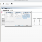
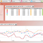
- This is a mock up of a software that presents energy consumption in residential buildings. To be more specific, it shows a suggestion for a dialogue that enables the user to select which period that should be shown in the report.
-
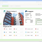
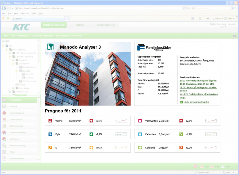
- I was asked to design a first page for an online energy consumption report tool, so that the administrator for the property can get relevant information at a glance.
-
- This is a mock up of an online tool for visualising energy consumption for the tenants. The page shown is the summary page, containing information on all the different consumables. If the tenants consumption is lower than the set energy savings goals, the tenant is greeted by a green page and a smiling smilie (the smilie is used in another energy tool as well, so this is efficient reuse of visual cues).
-
- This is a slightly different version of the mock up above. In this case there has been no saving, and the consumption is much higher than the set goals. The smilie is sad, and the user is awarded with a red screen.
-
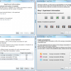
- These images are parts of a wizard in which the user sets the relevant energy consumption targets in the application above. The left alternatives are the developers take on design, the right alternatives are my suggestions. In the top pair of examples, the user enter the size of the apartment and number of residents. In the lower examples, the user is allowed to change the default values, to be able to save energy more aggressively, or not.